Project
UNITY TOWER / KRAKOW
Role
Creative & Design Consultant
Designing Unity
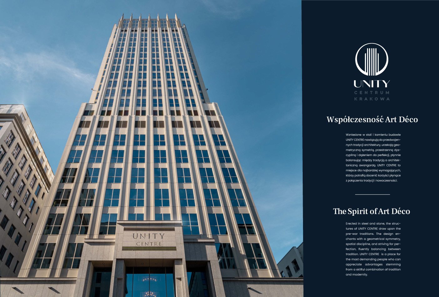
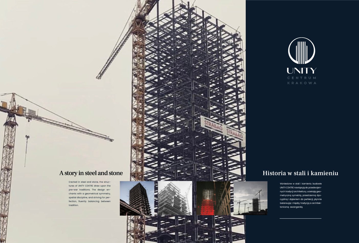
Building lifestyle in two languages
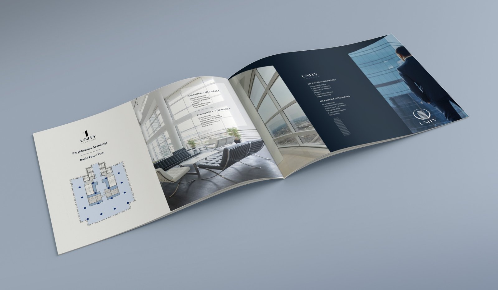
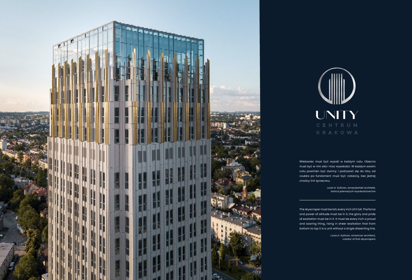
How to create a printed experience that showcases a historical building, creates a connection with cultural heritage, and delivers real state business in both Polish and English? The language barrier was one of the initial challenges due to the unique Cyrillic characters in Polish, then hundreds of building features, and floorplans, and finally communicating everything seamlessly in both languages. Overcoming this hurdle involves crafting iconography, logos, and concepts that resonate in both languages while reflecting historical and design nuances, influenced by brute architecture, Art Nouveau, and design history, adding complexity to the project.
![]()
Seamless storytelling in both languages
My approach was to craft a minimalist design that facilitates the organic flow of text, allowing for seamless storytelling in both languages. The goal was to establish a visual harmony where Polish and English coexist without overshadowing one another. This involved identifying subtle visual cues to guide the audience’s navigation through the content.
Also, I designed a custom font for the logo and icons, drawing from the styles of Art Nouveau, functionalism, and monumental design. This added cultural depth and historical resonance to the visuals, enhancing the audience’s experience.
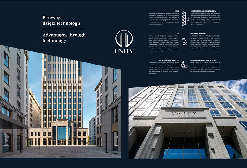

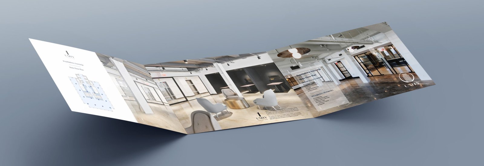
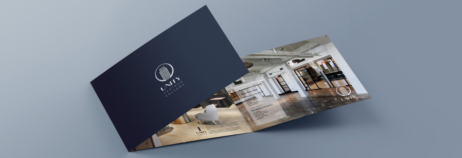
Creating an immersive experience in print
Given the abundance of text, the challenge was to create a layout with enough space and visual elements to accommodate both languages while maintaining consistency and aesthetic appeal. The goal was to effectively communicate all property highlights to both Polish and English-speaking audiences, despite the text-heavy nature of the content.